The 5-Second Rule: How to Improve Conversions on Your Website

Your Montessori school website is one of the key elements of your marketing strategy. That said, if it isn’t doing what you want or need it to do, it may be time to make some adjustments.
In an earlier blog we discussed the basics of web design and creating the perfect homepage. Not surprisingly, many of those same points come into play when updating your website to improve conversions.
What are conversions?
When a visitor—say, a prospective parent—comes to your site and does the thing you want him or her to do, such as schedule a tour or sign up to receive your newsletter, that is a conversion. It happens when a casual visitor takes that next step toward becoming a lifelong customer.
So what does all of this mean for you and your school? Quite a lot, in fact.
A highly converting website will attract more families, increase enrollment, and ultimately help your Montessori school thrive, which is why conversion optimization is so important.
So let’s talk about that 5-second rule.
Does your homepage answer these 3 questions clearly in just 5 seconds?
-
What do you do/sell?
-
How does it make people’s lives better?
-
What do they need to do to get it?
If you answered yes to all of these questions, congratulations! You’ve got this digital marketing thing figured out. If you hesitated or said no to one or all of these questions, it may be time to do some tweaking.
Let’s look at the first question:
-
What do you do/sell
The Montessori Method is a unique approach to learning with proven benefits for childhood growth and development—and it all begins with your school.
When prospective families visit your site, is the answer to this question easy to find? If not, often the first step is to get rid of the clutter.
It is difficult to convey a point when you are bombarding visitors with too much text and too many images, so keep your message clear and concise and your graphics clean and neat. That way, visitors will know exactly what it is you do.
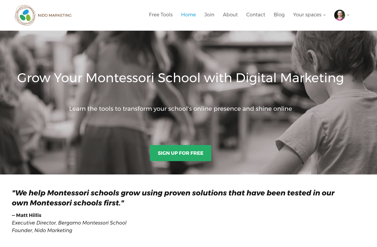
Let’s use the Nido Marketing website as an example:

The statement “Grow Your Montessori School with Digital Marketing” is very clear. Right from the start visitors know just what they’re getting: digital marketing support so they can help their school be even more successful.
It’s just a few words, but those few words are enough to have an impact and let people know exactly what we do.
-
How does it make people’s lives better?
In looking at the Nido Marketing homepage once more, the answer to this question can be found in the statement, “Learn the tools to transform your school’s online presence and shine online.”
Simple—yet powerful.
Montessori educators, many of whom may not be digital marketing wizards, understand they will have the tools and resources necessary to help their schools stand out online and attract the attention of more families. Why is this helpful?
It takes the stress out of developing a digital marketing strategy and gives them more time to focus on the day-to-day activities of their school.
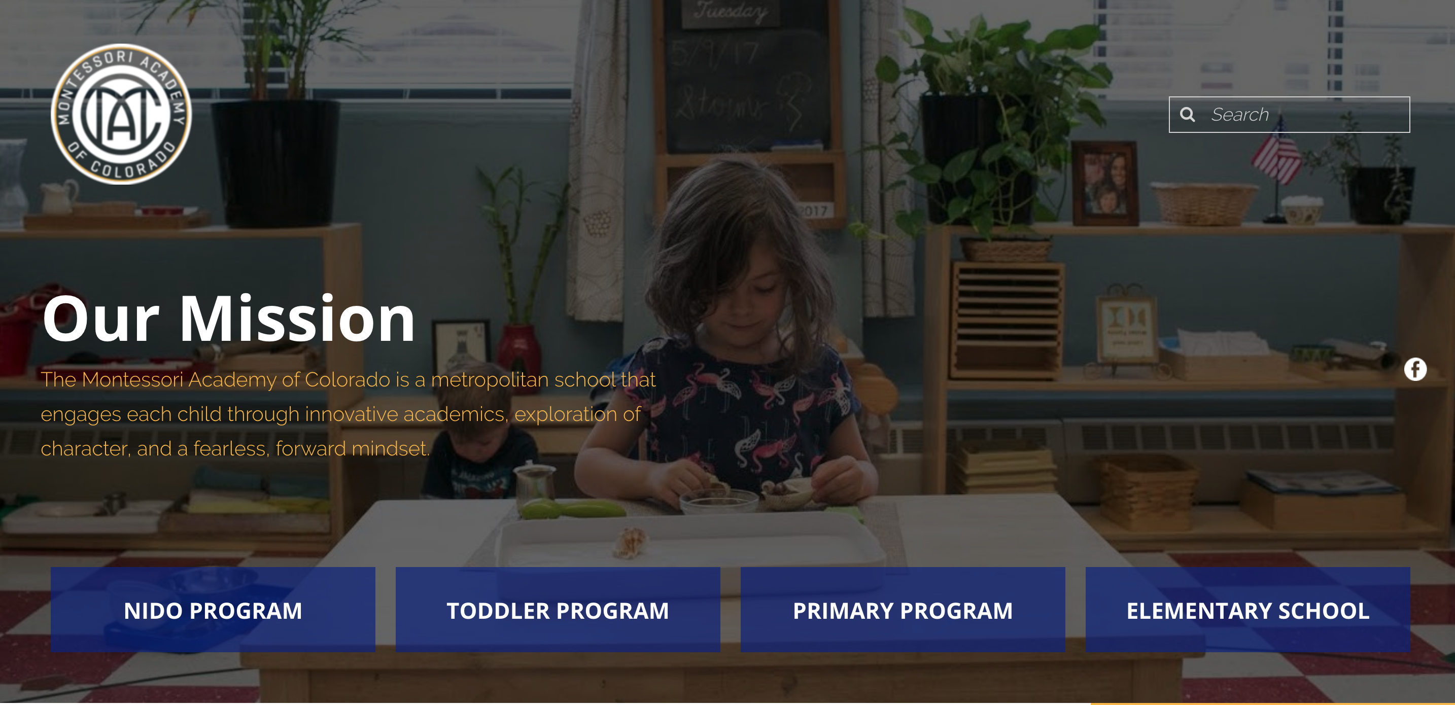
Keeping this example in mind, what is your message? How is your Montessori school improving the lives of children and families? Consider the website of the Montessori Academy of Colorado:

Their homepage provides a clear and simple statement of how they are making a difference—by engaging each child “through innovative academics, exploration of character, and a fearless, forward mindset.”
With a clean image and very few words, MAC offers a powerful message of what it is they do and what they can offer.
-
What do they need to do to get it?
Finally, once visitors understand what it is you do and how it can positively impact their lives, they need to know how to get it.
This is where a prominent call to action comes into play—typically a brightly colored button that prompts visitors to do the very action you want them to do.

For your Montessori school, your call to action will likely guide visitors to “Schedule a Tour” or "Request Information". You want to clearly outline what their next step should be if they want to move forward.
Let’s make some conversions.
Now that you know the basics, take a look at your Montessori school website and ask yourself whether or not there is room for improvement.
If you need a little extra guidance, be sure to join the free membership community at Nido Marketing to share ideas and see how other Montessorians have successfully improved conversions on their websites.
You can also schedule a free consultation with the experts at Nido Marketing—the only marketing agency in the world founded by a Montessorian to focus exclusively on Montessori schools.
This post was inspired by StoryBrand. Click here to find out more.

0 comments
Leave a comment