Don’t Make Your Visitors Think: The Neuroscience behind Conversions
Digital marketing is not just a pretty face; there are brains behind it, too.
When we recommend things like adding a prominent call to action to your home page, we aren’t just tossing ideas out there willy-nilly.
Instead, we’re applying what we and countless other marketers have learned from decades of research.
And, believe it or not, that research includes learning how to apply the principles of neuroscience to improve marketing success.
What is neuroscience?
In simple terms, neuroscience focuses on the nervous system (which includes the brain) to better understand why we do the things we do.
As a smart Montessorian, you can probably guess why this might be helpful in terms of digital marketing.
Understanding what motivates people to take action can go a long way toward creating a successful marketing campaign, which is why a lot of marketers nowadays are looking to neuroscience.

How can Montessorians use neuroscience to encourage conversions?
We’re glad you asked.
Remember that a conversion happens when a parent comes to your site and does the thing you want him or her to do, such as schedule a tour or fill out a form to request information.
When we think about this in terms of neuroscience, we are trying to figure out why that parent took action and how we can get more parents to do the same—which involves knowing a little bit about how the human brain is hardwired.
Humans have certain innate behaviors that stem from a time when everyday actions literally might mean the difference between life and death.
Having a close social group, for example, meant acceptance and safety.
Even today, people have a powerful need to find connection with other people, so much so that social rejection shares the same neural pathway as physical pain.
How can you use that to your advantage to increase conversions?
Appeal to parents by creating a sense of belonging.
Think about it.
You have the perfect audience for this: parents who want to raise bright, creative, and successful children.
That said, content that speaks to the social similarities between prospective parents and your existing parents can be a powerful conversion tool.
For example, instead of saying, “Hear what people are saying about Sunny Days Montessori School!” you might want to consider saying, “Hear what some of our happy parents have to say about Sunny Days Montessori School!”
Simply changing “people” to “happy parents” gets site visitors thinking, “I want to be a happy parent, too.” They want that connection and sense of belonging.
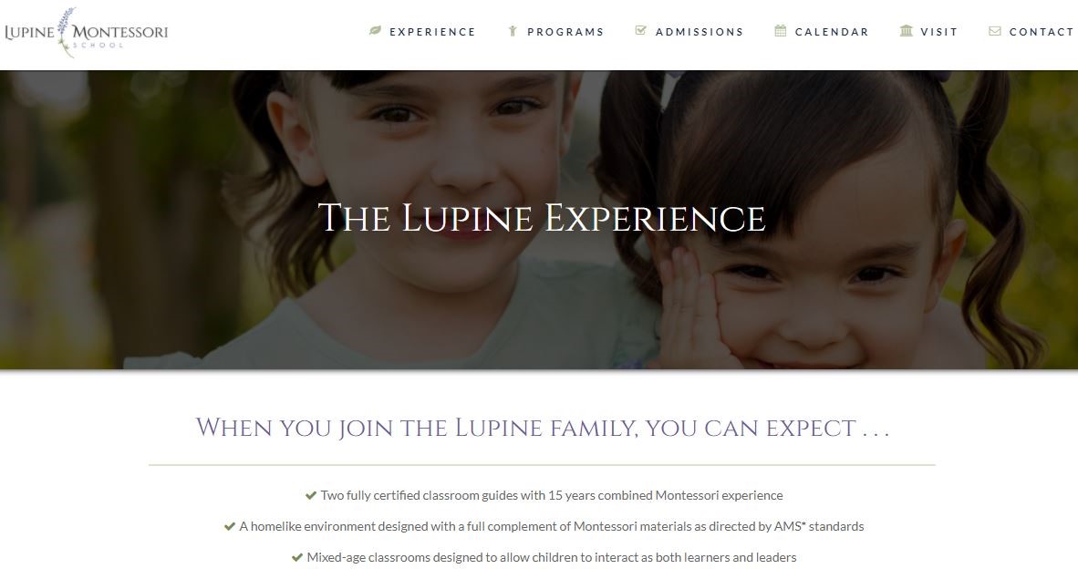
Even the graphics and photos you choose can appeal to the need for social similarity, which gets you one step closer to increasing conversions.
Next, think about your content in terms of processing fluency.
If it sounds like one of those bookish psychology terms, that’s because it is.
Processing fluency, sometimes called cognitive fluency, refers to how quickly and easily a person is able to absorb and process new information.
And here’s the kicker: most humans believe the faster we can grasp a piece of information, the truer it is.
Why is that important for you? Because truth leads to trust—and trust leads to conversions.
Nearly every element of your website influences processing fluency—text, font, layout, photos, colors, and so on—which is why we continually stress the importance of simplicity to ensure a high-converting website.
One of the simplest ways improve processing fluency is with a well-defined call to action. Check out this great example from Nido Marketing member Aldea Montessori in Phoenix:
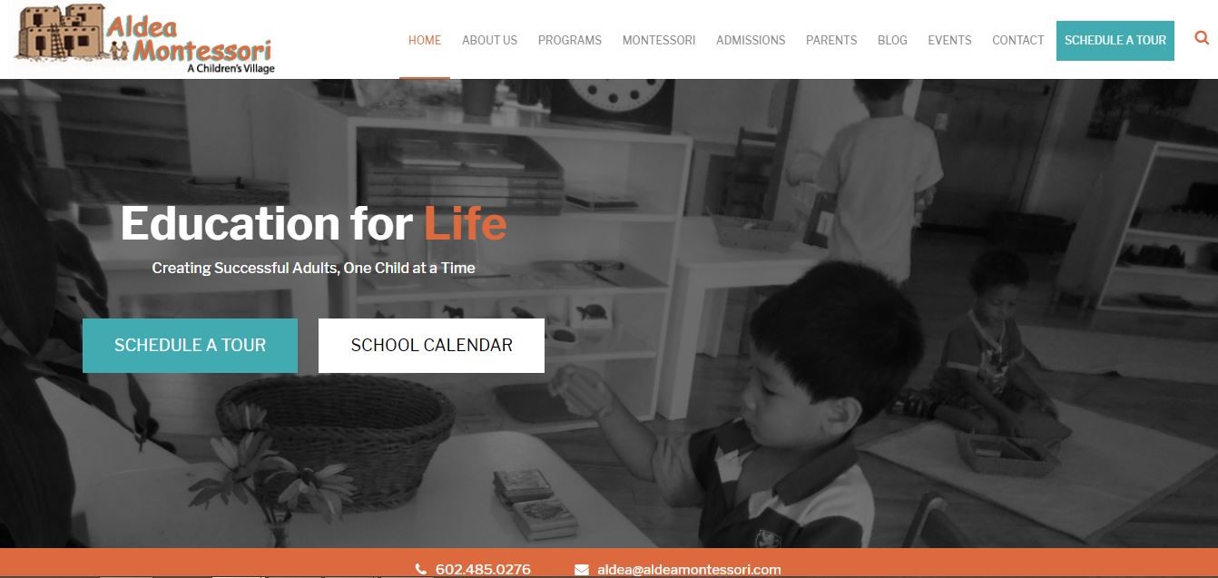
Why is this example so great? A few reasons:
- The call to action button stands out because of the contrasting color.
- There is not a lot of surrounding text to draw attention anywhere else.
- The background image is subtle enough that you notice the call to action first.
- The call to action is repeated on the page (see the upper right corner).
These elements combined allow parents to quickly and easily understand the call to action, which means they will be more inclined to perform the desired action.
And voilà! Another tour scheduled.
Finally, never underestimate the foot-in-the-door technique.
Another interesting fact about how the human brain works?
The simple act of completing a request makes us more likely to complete similar (often larger) requests when asked later on.
Social scientists call this the foot-in-the-door technique, and it’s another one of those intrinsic human behaviors you can make use of to drive conversion rates.
The basic idea is that a smaller yes will lead to bigger yeses down the line.
So, let’s say your primary call to action is to “Request Information” as in the example below from Hollis Montessori School.
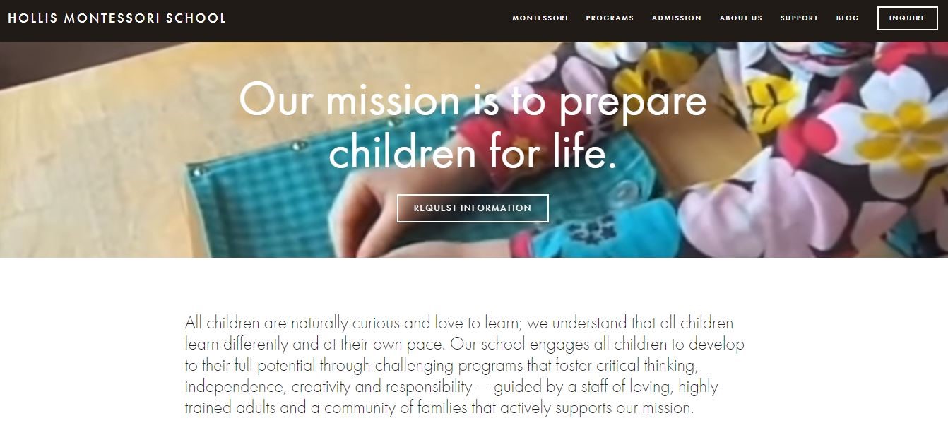
A simple enough request, right?
Parents click on the call to action button and fill out a brief form—maybe to get more information about the Primary Education program—and soon after they receive an email with the requested information.
Here’s where the neuroscience magic happens.
Now that they’ve given you one yes (by clicking on the button to request information), in that follow-up email is a great place to add an another call to action button, this time to come in and take a tour.
In theory, because they said yes to your initial request, parents are more likely to agree to this new request, if only to stay consistent with their previous actions.
Of course, neuroscience isn’t foolproof—which is why testing is so important.
Your Montessori school website may check off every must-have on the list, but it still doesn’t mean we can predict human behavior.
What goes on in the brain to make parents want to click a button or continue to the next page of your site is not always clear, which is why we always come back to testing.
Split testing different elements of your website lets you see exactly what’s working and what’s not—even something as simple as the color of your call to action button. (Red buttons are the highest performers, by the way.)
This is all pretty interesting, but it’s just one more thing to think about.
The good news is that we created Nido Marketing so you don’t have to think about things like applying neuroscience principles to increase conversions.
After all, digital marketing is what we do; running a successful Montessori school is what you do.
Give us a call today and let’s talk about how Nido Marketing can help turn your Montessori school website into a high-converting powerhouse.
And don’t forget to join our online community, where you can collaborate with other Montessori educators and get exclusive access to more digital marketing tips, tools, and easy-to-navigate courses.

0 comments
Leave a comment