A New Website For Country Hills Montessori Gives Families A Great First Impression
Key Insights
- Enhancing User Experience
- Montessori Content: Montessori Imagery
- Device Compatibility
- Gating Tuition
- Lead Generation
- Building a Website Parents Can Engage With
About Country Hills Montessori School
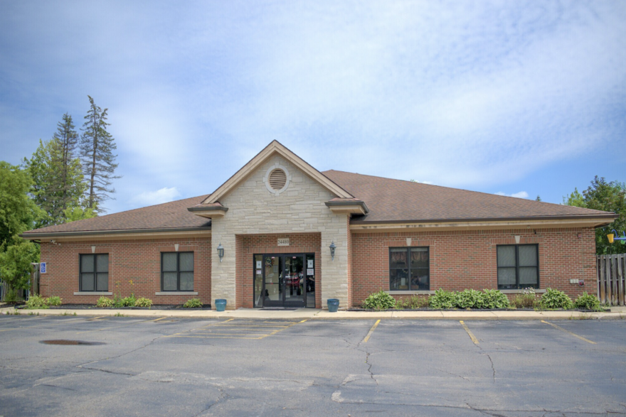
Country Hills Montessori offers individual attention in a nurturing environment. Established in 1985 and located on one acre in Farmington Hills, Michigan, their campus is beautiful and rich in history. Tall trees and a quiet neighborhood surrounding the nurturing, learning environment of Country Hills Montessori, creates an educational oasis for children. They offer programs to children ages 14 months to 9 years as well as a summer program. Each of these programs offers mixed age groups, so children can adapt to working with others.
Country Hills prides itself on its individual approach to education and offers different educational experiences for every child. Children can choose the subjects they want to study, depending on their interests. Montessori philosophy is at the core of their educational approach. They also offer a variety of activities as part of their program, these options include art, music, foreign language, gymnastics, dance and ballet, ukulele, gardening, creative movement, science, math, geography, and reading skills. Throughout their curriculum, children are encouraged to reason, cooperate, negotiate, and understand. Country Hills’ educational approach for children has been so successful that they now offer an elementary program for children ages 6 to 9.
Country Hills is truly an educational oasis for its students. The staff at the school are dedicated to creating a strong community and experience for every family, they just needed to reach more mission-appropriate families to fill their programs. Nowadays, a great website has the power to do that! That's why they reached out to Nido Marketing.
Enhancing User Experience: Building A Great School Website
Building a Montessori website that enhances user experience and increases engagement is crucial for several reasons, especially in the context of attracting and retaining prospective families. A school website that is well-designed, full of purposeful content, and includes lead generators is the greatest marketing asset a Montessori school can have. Here's why it is important for a school to prioritize these aspects:
First Impression and Credibility:
A school's website often forms the first impression that prospective parents have of the institution. A well-designed and user-friendly website reflects professionalism and attention to detail, establishing credibility and trust.
Effective Communication of Montessori Philosophy:
The Montessori approach is unique, and the website serves as a powerful tool to effectively communicate this philosophy. Clear and engaging content, coupled with multimedia elements, can help convey the essence of Montessori education to prospective parents.
Engagement and Connection:
An engaging website encourages prospective parents to spend more time exploring the content. Engaged visitors are more likely to connect emotionally with the school, increasing the chances of them considering enrollment.
Virtual Experience of the School Environment:
For parents who may not have the opportunity to visit the school in person, an interactive and visually appealing website, possibly featuring a virtual tour, provides a virtual experience of the school environment. This can significantly influence their perception and decision-making.
User-Friendly Enrollment Process:
Prospective families who visit a school website should know exactly how they can take the next step in the enrollment journey. Whether that's to fill out a contact form or schedule a tour directly on the school website, a call to action should always be clear. This increases engagement and provides a more positive experience for families visiting a school site.
Showcasing Community and Culture:
A well-designed website can effectively showcase the school's community, culture, and values. Testimonials, success stories, and images that capture the daily life of the school contribute to creating a sense of belonging and community engagement. When a family commits to a school, they commit to a new community with a strong mission and vision. A Montessori website should present Montessori content and imagery, this is crucial when giving families an authentic insight into your school's culture and approach to education.
Information Availability and Transparency:
A well-maintained website provides timely and accurate information. This transparency helps build trust with parents by offering a reliable source of information on school policies, curriculum details, events, and other essential aspects of the educational experience.
Country Hills Before Nido Marketing
Before working with Nido Marketing, Country Hills had a school website that felt more generic than Montessori. After our initial review of their school website, the following are the areas that we felt needed improvement:
- Montessori Imagery: Country Hills' original school website utilized stock imagery that was not relevant to Montessori. The use of this photography felt inauthentic to the mission and vision that Country Hills' has as a school. It didn't tell a true story about their approach to education. The stock images that they were using are also frequently used on early childhood websites. This can make prospective parents question the credibility of the school and leave them wondering what the classrooms and programs actually look like.
- Montessori Content: There was not a lot of content that helped families understand the unique benefits of Montessori education. Instead, Country Hills focused on outlining what their programs covered. The issue with this is that often, families may not yet know what Montessori education entails. This is why it's important to include some background or foundational information about the Montessori approach and its benefits. This can invite families to learn about Montessori directly from your school website and feel more curious to reach out and learn more. Having a "What Is Montessori" page can help, as well as publishing blogs and offering resources directly on a school website.
- Limited Navigation Bar: The only actions a prospective parent could take on Country Hill's website were to learn more about the history of the school, the programs, and fill out a contact form to request a tour or ask any follow-up questions. This left little room for engagement.
- Design and Usability: Country Hills' original school website used a more generic design template and was not particularly easy to use across devices like smartphones or tablets. It's crucial to have a dynamic design that breaks up text, has calls to action, and is easy to navigate across devices so that any family can easily access the information they need.
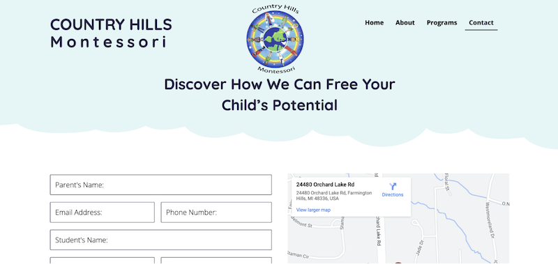
Country Hills' original website only included one lead generator and CTA, and that was their contact form. This was an area of opportunity, by adding another lead generator to collect valuable contact information, we could increase their leads. This could be a tuition request from, a whitepaper, a parenting resource, or a quiz. There are various lead generators that a school can include on its website.
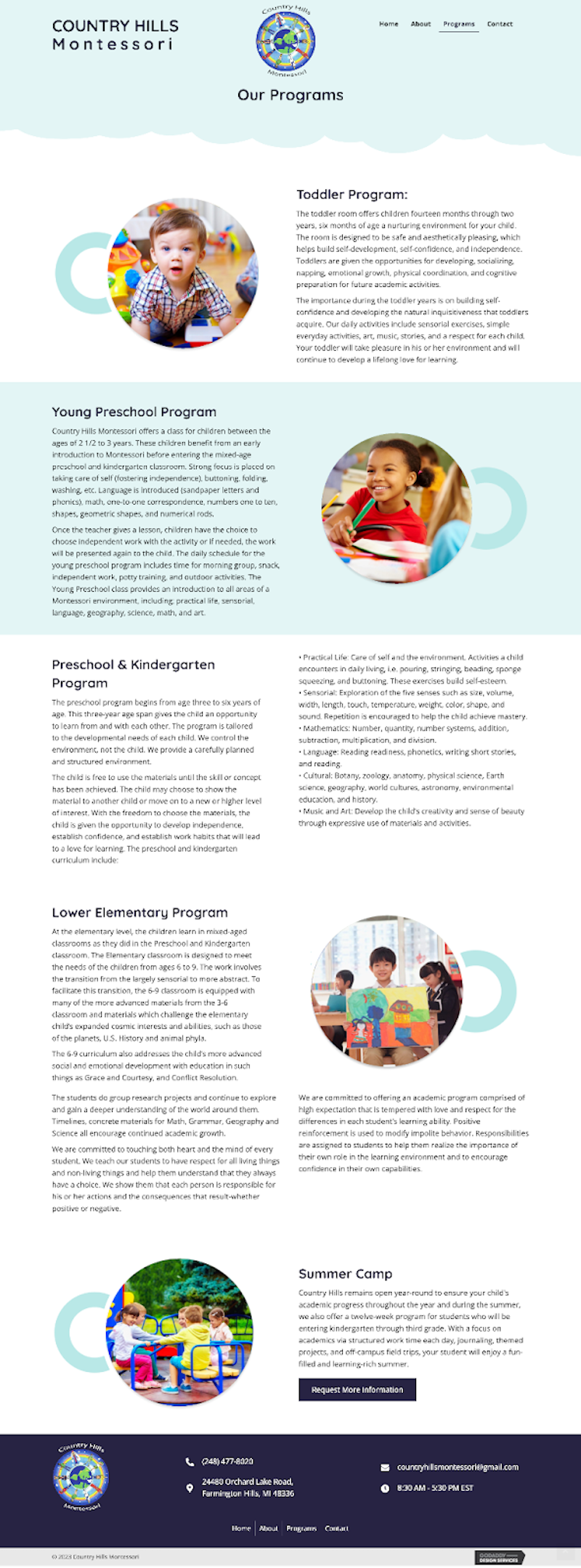
Country Hills program information was all on one page. The content needed some work as it was a very vague outline of what the program entailed. Parents need to see the benefits first. We knew that with some re-working, some testimonials, and providing more insight from a Montessori perspective would improve the program information page. We also wanted to make sure that every program had its own page so that parents would not need to scroll to find what they were looking for. This makes their experience more custom.
Overall, we felt that these areas of opportunity meant that there was a lot of potential for more growth and enrollment. Our web development team got to work and ensured that Country Hills Montessori got a website they would be happy with. The website build-out process takes a month, and our web support team is there to help during the build-out process and beyond in case Country Hills ever needs to make any edits or updates.
Country Hills' New Website
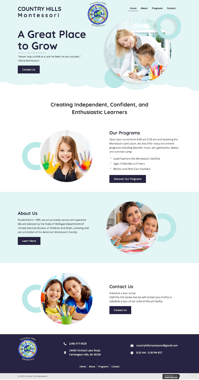
All of the websites that we build at Nido Marketing are fully customizable. Each school has unique requests and needs. Our team worked closely with Country Hills to make sure that the content and design of the website were up to scratch. Let's take a look at their new homepage:

Country Hills' new homepage creates more opportunities for engagement. Prospective families can easily take the next step in the enrollment process and learn more about the benefits of Montessori and Country Hills' unique offerings. Here's what we changed:
- Montessori Imagery: When we build Montessori websites, we have a Montessori stock photo library to utilize. This means that all of the imagery is representative of Montessori environments. This helps tell an authentic story. Now instead of having general stock photo imagery, Country Hills has Montessori-relevant imagery that gives families an insight of what they can expect their child to experience.
- Montessori Content: Now Country Hills has a dedicated blog where families can learn more about the Montessori approach as well as information throughout their school website that will inform families what Montessori education is, what it entails, and what are its benefits.
- Social Proof: In Montessori marketing, social proof is crucial. We made sure to include several reviews throughout Country Hills' new website. This will help them build credibility and impress families.
- Dynamic Design: The design and layout of the new website are easy to navigate and include plenty of content while still breaking it down and making it more consumable to the website visitor. A parent can gain a lot of information just from browsing the homepage.
- Device Compatibility: This school website is easy to navigate on any device. This means a busy mom can easily fill out a contact form from her phone, tablet, or laptop in a minute or two. Ease of use is crucial if schools want to appear professional and credible.
- Improved Navigation: Country Hills' new website has more meat! There is a lot more content on the benefits of Montessori, including a blog and a drop-down button where families can learn about the Montessori approach directly from Country Hills.
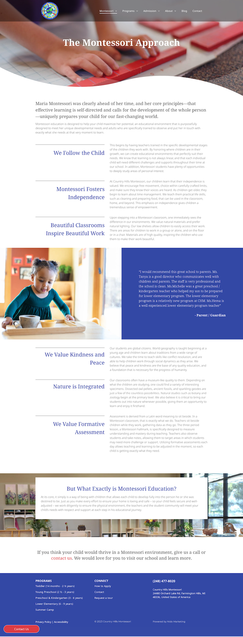
By including content like this, Country Hills can become a thought leader in the Montessori space for parents visiting their website. Including content like this builds trust and ensures families that they are reaching out to a school that ensures a high-quality Montessori education.
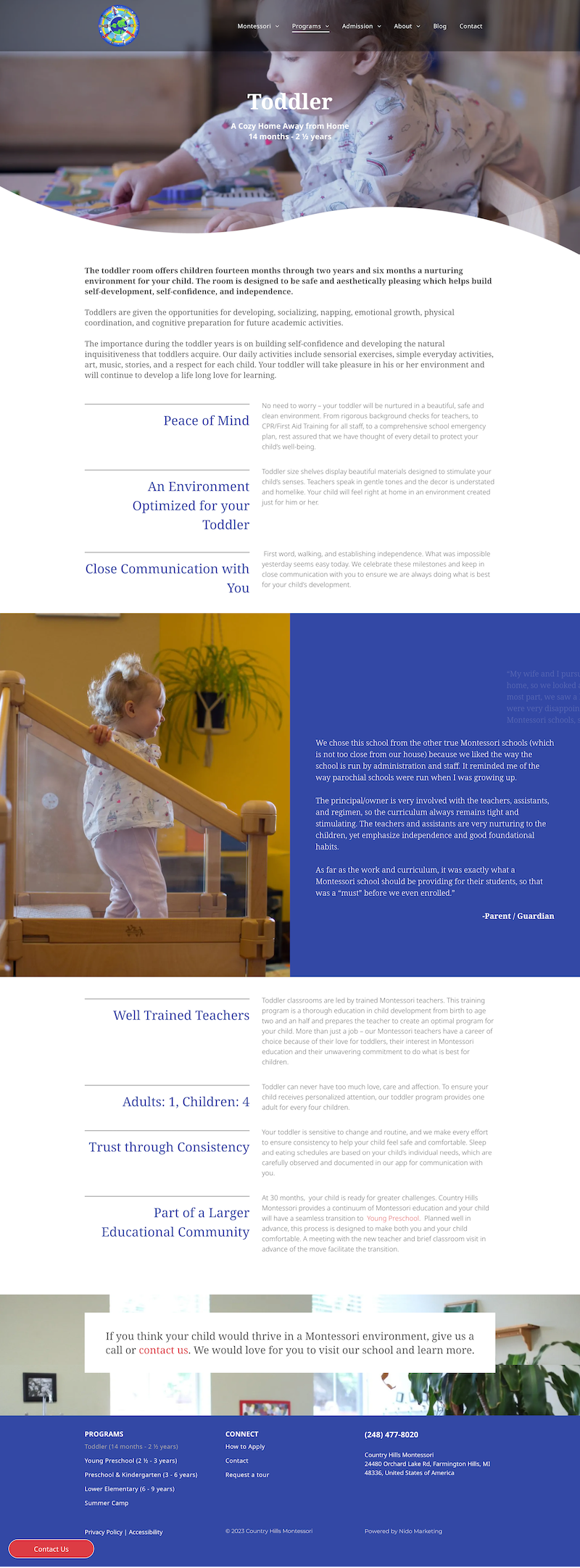
We also worked with Country Hills to bulk up their program information to provide more insights to families. Each program gets a dedicated page where families can get a better understanding of what to expect and what their child will gain by going to Country Hills. We also made sure to include social proof here and another CTA for visitors to contact Country Hills to request a tour or more enrollment information.
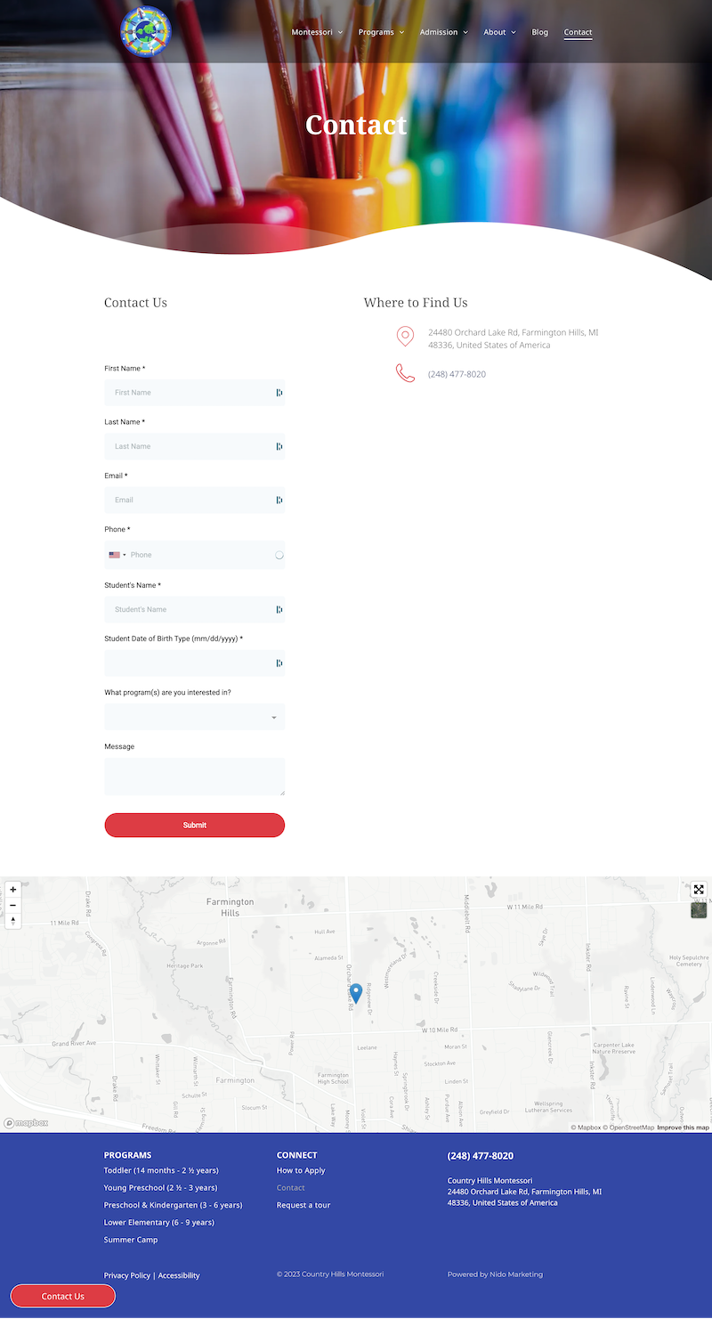
Country Hills' main CTA is to fill out a "Contact Us" form. This allows them to reach out to parents with tour scheduling information as well as collect important lead generation. This works for them because they want to give a personalized approach to every family that fills out a form.

We also added another lead generator on the Country Hills website by gating their tuition. Tuition and fees are usually the number one thing parents want to know, this means it's to every school's advantage to keep this locked away in exchange for contact information. This is the biggest pain point, and we feel that it's important to highlight the benefits and value of education before showing them the price right away. This is why we built a landing page focused on breaking down the value before the cost. Parents can request a personalized tuition form via email. This has helped Country Hills get more valuable leads and introduce themselves properly to families before offering this information.
A Lasting Partnership
We are thrilled that Country Hills has a website that reflects the amazing quality of their Montessori programs. This website has already helped them generate more leads and impress prospective families. We hope to have a continued partnership with Country Hills Montessori School as they grow and expand their school programs and build a stronger community.
Thank you to Country Hills for all that you do for your community and future generations!

0 comments
Leave a comment